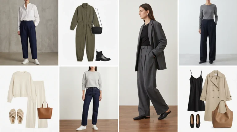
Summer 2026 Color Trends: 9 Shades Worth Adding to Your Wardrobe Right Now

Every summer brings a new wave of color — and summer 2026 is genuinely one of the more exciting seasons in recent memory. Not because the palette is wild or unwearable, but because it actually makes sense for real life.
After going through the Pantone SS26 Fashion Color Trend Reports for both NYFW and LFW, one thing is clear: this season isn’t asking you to pick a side. You can go bold or stay grounded — and either way, you’ll be on trend. Here are the 9 key Summer 2026 Color Trends to know, and exactly how to wear them.
The 9 Summer 2026 Colors to Know — From Bold Statements to Quiet Neutrals
According to Pantone’s official SS26 coverage reported by FashionUnited, this season’s palette blends “mood-boosting brights” with “an expanded range of neutrals, well-loved heritage shades, and modern mid-tones” — all designed to empower personal expression rather than dictate a single look. That duality is exactly what makes these 9 colors worth paying attention to.
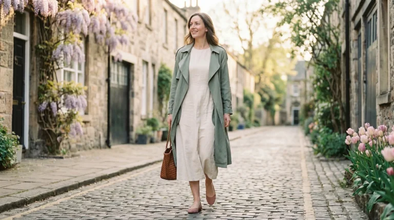
1. Cloud Dancer — The Warm Off-White You’ll Wear on Repeat

Cloud Dancer earned its spot as the 2026 Color of the Year for a reason. It’s a soft, warm off-white — not the stark, fluorescent kind that washes you out in daylight, but the kind that makes a simple linen set look like it cost three times what you paid for it.
How to wear it: Keep it head-to-toe for a clean, minimal look, or use it as your base and layer in a bolder SS26 shade as an accent. It pairs especially well with Cognac and Marina Blue
2. Canary Yellow — Summer’s High-Impact Moment
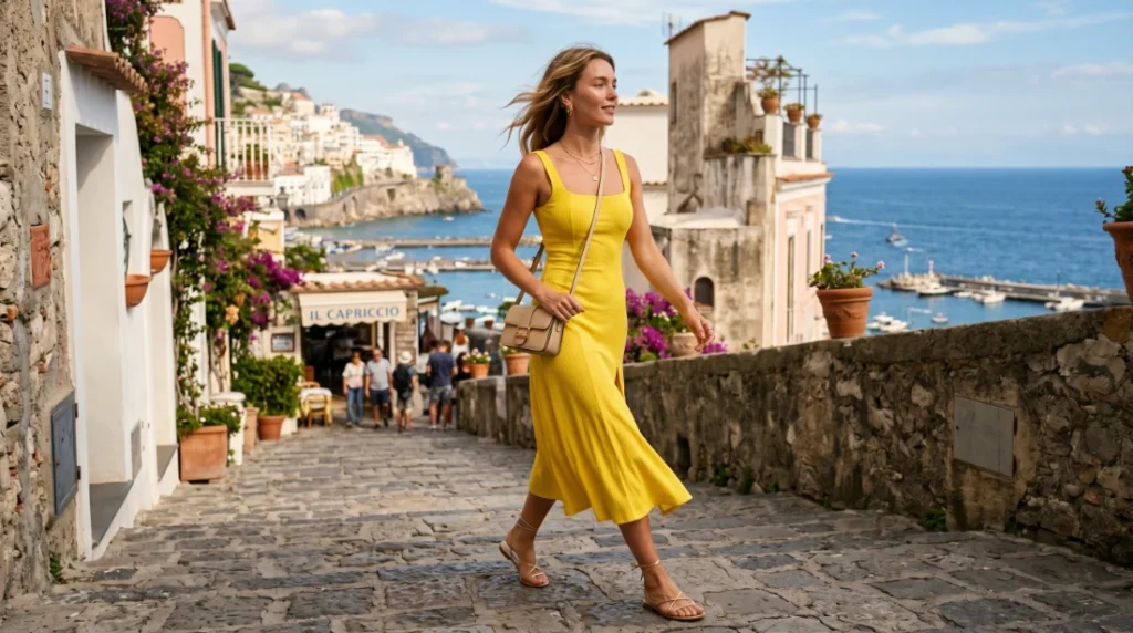
Yellow has always felt risky, but Canary Yellow as seen across NYFW SS26 collections makes a strong case for committing fully. It’s saturated, unapologetic, and works as both a dress and a two-piece set. The key is keeping the rest of the outfit simple — let the color do the talking.
How to wear it: A fitted Canary Yellow dress with barely-there sandals is all you need. If you want to ease in, try it as a top paired with white or cream bottoms.
3. Cherry Red — The Power Color That Refuses to Retire
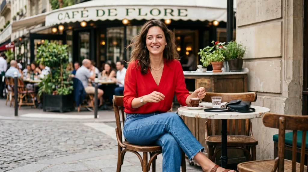
Red is cyclical on the runway, but Cherry Red specifically — a pure, true red without too much orange or burgundy — keeps showing up in SS26 recaps because it simply works. It’s one of those shades that completely transforms even the most basic outfit.
How to wear it: A Cherry Red top tucked into straight-leg jeans is an instant outfit. For something more elevated, a red midi skirt with a neutral blouse pulls the same energy with less effort.
4. Tickled Pink — A Grown-Up Take on the Pink Moment
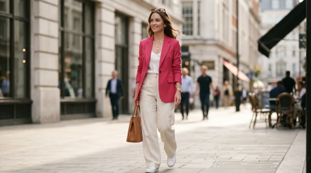
Yes, pink is still having its moment — but Tickled Pink for SS26 is a more refined version than what we saw a few years ago. The Pantone SS26 reports call it out as a sweet but structured shade, and the styling direction leans into clean silhouettes rather than maximalist dressing.
How to wear it: Structured co-ords in Tickled Pink look polished without trying too hard. A tailored pink blazer over wide-leg trousers works just as well in the office as it does out to dinner.
5. Muskmelon — The Softer Orange That Actually Works
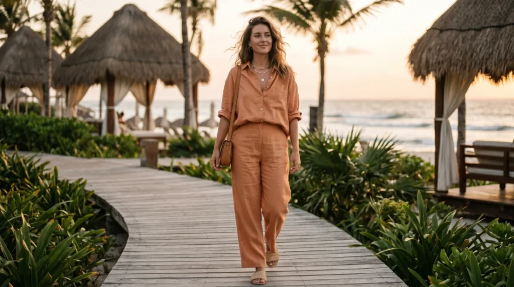
If orange has felt too loud to you before, Muskmelon might change your mind. It’s a warm, hazy melon tone — closer to a tropical sunset than a traffic cone. The Pantone SS26 palette lists it as a standout “juicy highlight,” and once you see it styled, it’s hard not to want it.
How to wear it: A Muskmelon linen set is the ultimate effortless summer outfit. For a more casual take, try a Muskmelon top with your favorite pair of washed-out denim.
6. Marina Blue — The Blue That Works Like a Neutral
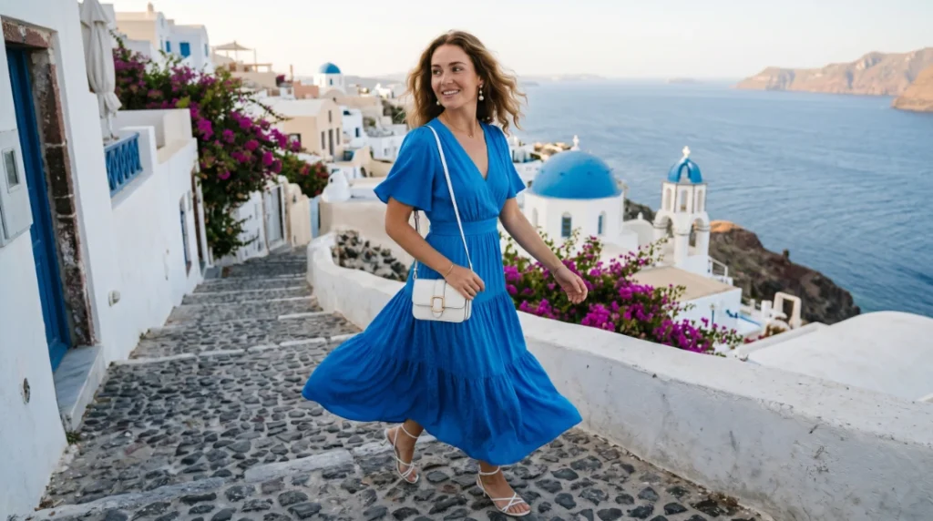
Marina Blue is clear and crisp — the exact shade of water on a good beach day. It was a standout across NYFW SS26 collections because it has this rare quality of feeling like a statement and a neutral at the same time. Nearly every skin tone looks better in it.
How to wear it: A Marina Blue midi dress with white accessories is one of the easiest summer outfits you’ll put together all season. It also works beautifully in a cardigan-over-white-top combination for a more layered look.
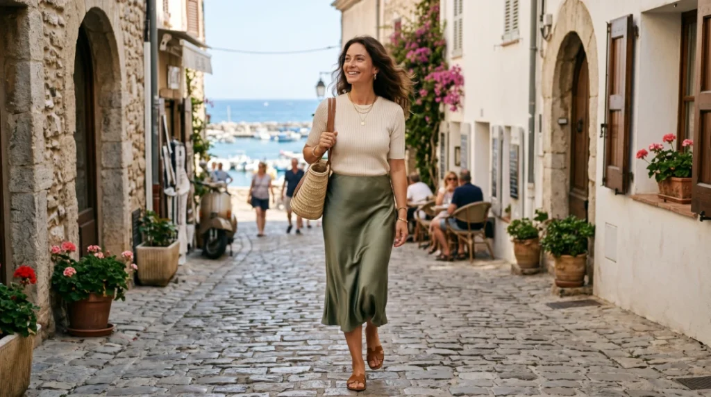
7. Burnished Lilac — The Muted Purple That Grounds Everything
Think of Burnished Lilac as the new sage green. It’s a smoky, vintage-tinted lavender that doesn’t compete with other colors in your wardrobe — it quietly makes them look better. Pantone described it as a “tinged and smoky lavender tone with a perfumed vintage feel,” and it showed up in both the NYFW and LFW SS26 reports.
How to wear it: Burnished Lilac linen trousers with a white tank is an understated combination that always looks intentional. It also works as a cardigan thrown over a more neutral outfit.
8. Shale Green — The Minimalist’s Best Friend
Shale Green doesn’t ask for attention, and that’s its whole appeal. It’s a muted, earthy green that works as a bridge between your bolder summer pieces and your everyday basics. Think of it as the color that makes a capsule wardrobe feel cohesive without being boring.
How to wear it: A Shale Green midi skirt with a white or cream top is a combination that looks put-together with essentially zero effort. Layer it under a neutral cardigan when the evenings cool down.
9. Cognac — The Warm Neutral That Makes Everything Look Expensive

Cognac is what you reach for when tan feels too flat. It’s deeper, richer, and warmer — and it has a way of making every other color on this list look significantly more elevated when paired with it. It appeared consistently across SS26 as the grounding neutral of the season.
How to wear it: A Cognac slip dress accessorized simply is one of the most effortless summer looks going. It also works as a trouser option when you want a warm neutral base for brighter SS26 tones.
The throughline across all 9 of these colors is exactly what Pantone intended for SS26 — a palette that feels expressive without being prescriptive. Whether you’re building full outfits around Cloud Dancer and Burnished Lilac or going all in on Cherry Red and Canary Yellow, there’s enough range here to dress for the summer you actually have.